What Is the Best Color for a Checkout Button on an E-Commerce Site?
What color is the checkout button on your e-commerce site? Now here’s a harder question: what’s the best color for a checkout button?
Get a Free Marketing Analysis and Consultation
Nowspeed can review your Website, SEO, PPC, Email or Social Media Campaigns and identify ways to make an immediate impact!
Asking what checkout button color goes well with your e-commerce site is like asking what tie color complements your suit. To answer the question, you have to look at the overall color palette, and then choosing the tie/button that is most pleasantly noticeable.
But I thought orange was supposed to be the best button color.
That’s what many infographics (here and here) appear to indicate, at least a few years ago. Other articles have suggested blue and green, while others still appear to favor red and yellow. The rationales for these varying opinions appear to be based on pop psychology. Here’s a quick rundown on the emotions and behaviors that are typically ascribed to popular colors:
- Yellow: Youthful, spry, optimistic, and vigorous. Yellow is supposed to command attention, especially with younger customers.
- Orange: This is supposed to be the epitome of attention grabbers. It’s an aggressive smack to the face that says “buy me now!” This is sometimes referred to as BOB: Big Orange Button.
- Pink: Often associated with the feminine and romantic, pink is supposed to be particularly effective in marketing to women.
- Red: Danger, stress, don’t proceed without looking at this. This draws on the importance we often ascribe to stop signs, stop lights, and ‘danger’ signs.
- Green: Green can be associated either with money or the environment. This probably depends on the mindset of the viewer.
- Blue: Blue is very inoffensive. It’s tranquil, and creates a sense of safety.
- Purple: Another color that’s supposed to be soothing and comforting.
- Black: It’s pretty telling that Uber calls its upscale ridesharing service “UberBLACK.” In short, black is powerful, yet understated. It’s sleek and cool and sophisticated.
In reading the descriptions above, it should become obvious that you can create a rationale for choosing just about any color for your checkout button. And as tastes shift—or as the preferences of influencers change, anyways—the default “best” will change. This means that if the best color for a checkout button can change with time, then it’s just dictated by fashion. Don’t be a fashion victim.
Rather than agonizing over the color in absence of anything else, first focus on looking at your site and making sure your button is large enough to capture attention, and is placed in a spot that makes sense. Examples of good button locations include being opposite or next to logos, at the end or (in Western cultures) bottom right of an information process flow, or in the center of an otherwise uncluttered space. Don’t sprinkle your buttons all over the place, as this will only create distraction. Putting small pieces of reassuring information (microcopy) near the button can help.
Examples of good checkout and CTA button color and placement.
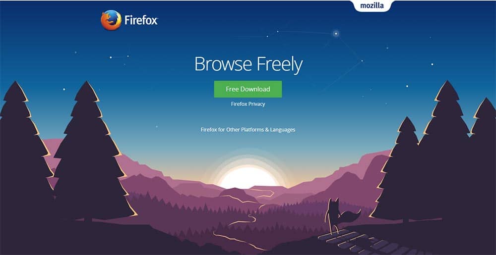
Let’s start with download button for Mozilla’s Firefox browser. The button is very conspicuous compared to the mellow, subdued color scheme of the page. It is centered below the two pieces of branding present on the page—the familiar Firefox logo to the top left, and Mozilla name to the top right. While green is a fairly mellow color, it contrasts nicely against the rest of the page. Given its location, you aren’t going to miss it.
Additionally, the button text is informative. It doesn’t just say “download.” It says “free download.” That brief two word explanation removes any apprehensions you might have had about clicking on it. “What’s to lose? There’s no risk.”
But that’s a free product. What if someone’s trying to sell you something? Take a moment to look at the current front page content for Netflix:
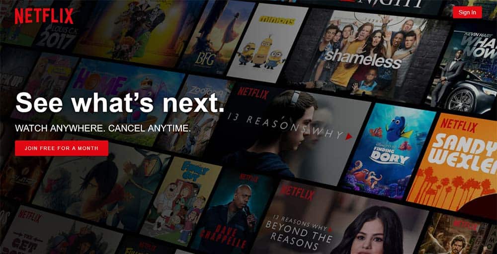
My initial reaction is, “Oh jeez, that’s so busy.” But then your eye starts to wander and realize that this is a sampling of the content available for just a few bucks a month. It gives you time to start thinking as your brain starts to explore the page: “That’s a lot of stuff. And my cable bill is starting to get kind of pricey. You see that big white statement “See what’s next” out of the corner of your eye, which reminds you that this is only the tip of the content iceberg.
And right as you get to the point where you’re thinking that you don’t want to spend a few more bucks a month, your eye finally latches onto that painfully bright red button with text in all caps: “Join free for a month.”
The text on that button disarms you by taking away your only real argument against giving Netflix a try: spending money. It’s free for a whole month. What’s to lose? You can always cancel. Of course, you never will…
Next, let’s take a look at Amazon’s “add to cart” button.
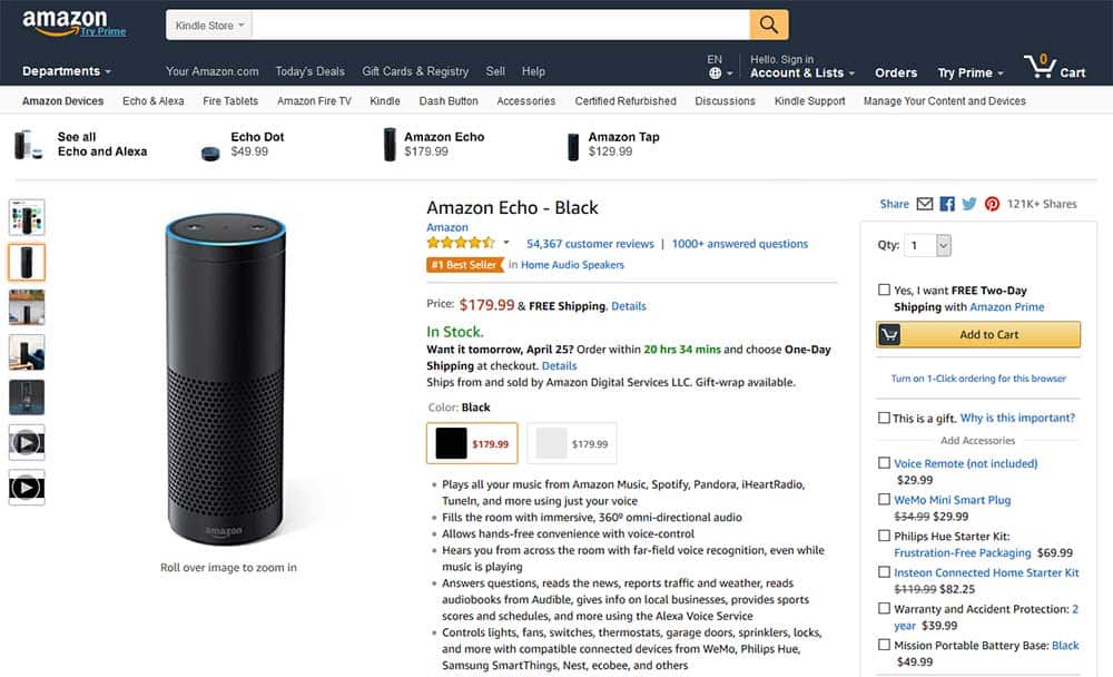
First of all, there is a LOT going on here. Between the menu, search bar, gallery images, link to related products, and product information, it would be very easy to lose track of the “Add to Cart” button.
What Amazon has chosen to do is to take advantage of the Western inclination to move from left to right. You glance at the top for the title, then start combing from the left to the right, and from top to bottom for each section: product images, price, variations, bullet point information, and then they catch you off guard by closing the deal: how many do you want, do you want free FREE Two-Day Shipping (in bold, of course), and then that nice enticing yellow-orange button.
Notice the five instances of orange on the page. Every time they use orange, they use it in very specific, actionable ways:
- The arrow in the Amazon logo to the top left. Notice that they use the arrow to point towards an offer to “Try Prime.” They don’t just let the logo hang out and take up space without paying rent. They make it do work by pitching a product.
- The search button to the right of the search bar. That little orange blob with the magnifying glass says, “Don’t just stop with this product. Find more stuff to buy. No matter what you want, we have it.”
- The star rating. These days, customers are strongly motivated by peer ratings. This is why even Google offers the seller rating extension for e-commerce sites.
- The small “#1 Best Seller” banner beneath the rating.
- And of course, the biggest chunk of orange on the page, the “Add to Cart” button.
None of this is the product of coincidence. Orange is their action color, telling you either the most important things about the product you’re looking at (its review rating and the fact that it’s a best seller), calling attention to other products to check out (the Amazon Prime offer and the search bar), or that tantalizing “Add to Cart” button. Note the language of the button. You’re not locked in. You’re merely putting it in your cart. You can always remove it.
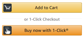
Of course, for those with impulse control issues, they’ve conveniently placed a small link below the button indicating that you can enable “1-click ordering,” which will add a slightly more excitingly colored dark orange button that says “Buy now with 1-Click.”
Also note the accessories they’ve included in that small outlined box that encapsulates the cart button. You don’t even have to leave the page to look at them. You can just check the boxes next to each option, then go back up and give in to Amazon’s siren song by clicking the cart button. Amazon has carefully designed that little strip of orange to pull a lot of weight on the page. And if Amazon’s doing it, you know it’s effective.
Now, let’s take a look at another one of the top 10 most popular e-commerce sites, eBay:
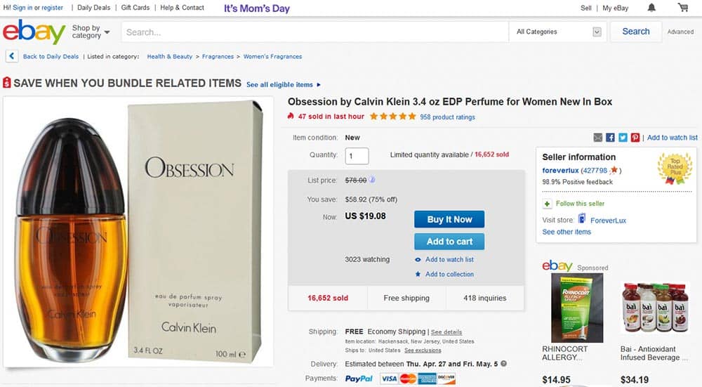
Honestly, I think that eBay’s layout is a bit too busy. However, they have carved out a decent chunk of real estate just off of dead center in the screen for their purchase buttons. Notice that to the left of the buttons, they’ve included information on how much you’re saving if you buy right now, while the product’s on sale.
They want to see that sweet sales price, and then allow your eyeballs (and mouse) to be drawn inexorably towards those enticing CTA buttons. Notice that they’ve replicated Amazon’s approach to the cart and “buy it now” buttons, but in blue this time. “Add to cart” is a light blue, while the “Buy It Now” button is a much more saturated, intense shade of blue.
As you’ve seen, effective CTA buttons rely on much more than color choice.
An effective CTA button relies on a variety of variables, including overall page design, placement in relation to other page elements, button text, and of course button color (and how that color contrasts and ties into other page elements).
Of course, you can’t know what’s going to work best just based off of this blog post. There’s no substitute for testing your design choices. Make a few variations of your product pages and test them on users. You can use Google Analytics Solutions, Optimizely or similar services for testing purposes.
Once you have some data as to what works best, then you can choose the design that works best for you. But don’t be afraid to continue experimenting occasionally. Tastes change over time. What works in 2018 may not work in 2019 or 2021. Toss out the experiments that don’t work, and incorporate the ones that do.
With careful testing, data collection, and observation, you can create incredibly effective calls to action that guide your customers towards desirable choices.
So let's
talk.
We're always excited to dig into the details of your company and what strategy can help you meet your goals. So let's talk and lay out a plan for success!